Packaging
2025
Salt & Ash
Packaging — 2025

Client: Salt & Ash · Role: Packaging, art direction · Output: Structural packaging, 4 SKUs, launch photography
Two ingredients, one die, four sizes. Salt & Ash smokes sea salt over foraged wood, and the packaging holds to the same austerity: a single structural die that folds into all four sizes, printed in one pass — black ash ink on salt-white board.
The typography is rubbed, not printed, on the limited runs: each label is burnished by hand through a brass stencil, so no two packs carry exactly the same black.
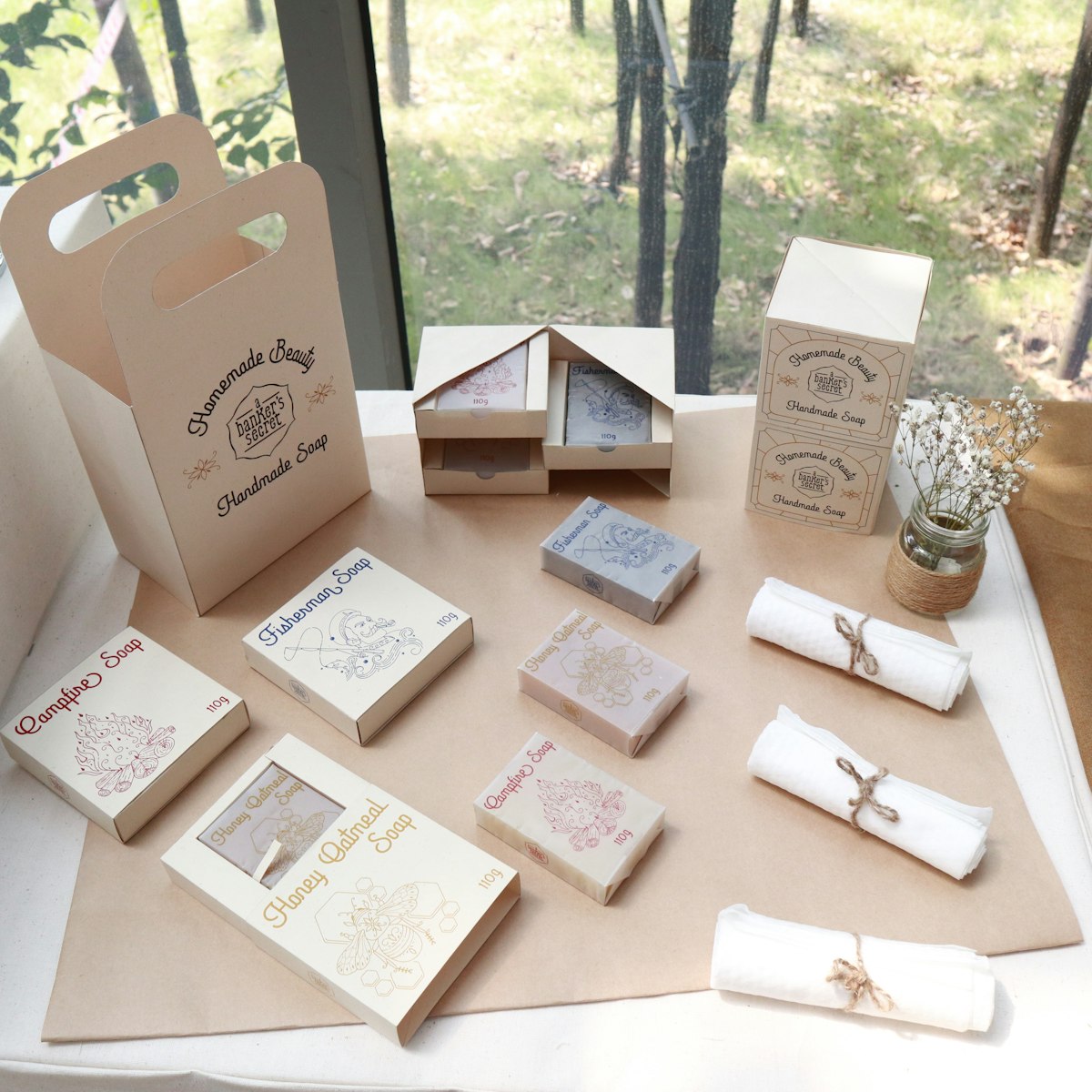
Launch photography shot the range like geology — raking light, no props — and those images now do all the brand's talking; there is no website, only a phone number embossed inside the lid.
"Packaging pared back until only the product's temper is left." — design annual jury

